(UPDATE: In 2020, ZZT’s source code was reverse-engineered and released as free software under the MIT License. ZZT is now potentially as malleable as Bitsy, depending on what people do with the codebase. This post predates that event, so any passages about ZZT’s limitations are referring to the last Epic MegaGames release, version 3.2.)
This post documents some work done to convert a Bitsy game to ZZT.
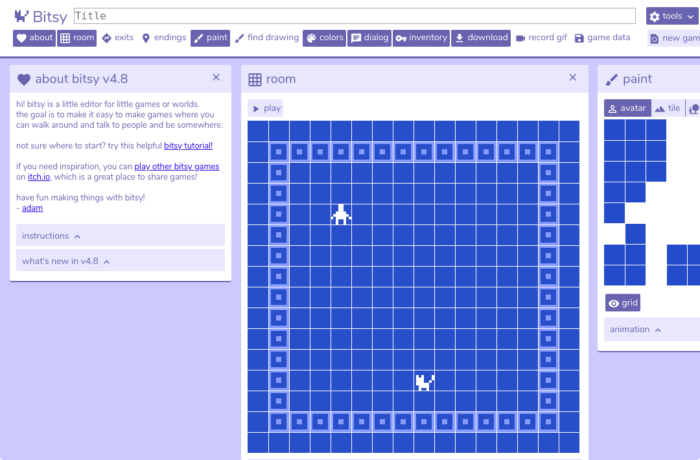
Bitsy is a game engine designed for making small browser-based games. Graphics are based on 16×16 rooms made of 8×8 tiles. It exports to HTML and is very accessible.
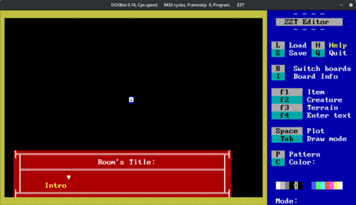
ZZT is a text-based action-adventure that enjoyed a very long after-market life, initially spurred by its built-in level editor. Boards are 60×25 in size, and are comprised of various terrain and objects that are represented by DOS text characters.
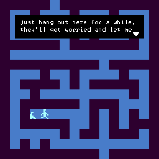 The game is Maze Minders, a short Bitsy adventure about various pixel-art stick figures wandering around an orthogonal labyrinth. This is not my best Bitsy effort — I was really just interested in drawing prancing 8×8 stick figures — but I went with it because the maps are almost entirely 8×8 solid blocks that would translate easily to ZZT’s DOS text mode.
I’m really happy to see Bitsy finding a community. It reminds me of ZZT’s following in a lot of ways, and I suppose that’s why I am doing this juxtaposition. Figuring out how to do certain things in these kinds of tools sort of becomes its own game.
Tools used
Bitsy 4.6 – 4.8 – By Adam Le Doux – Stock engine with no enhancements.
ZZT 3.2 — By Tim Sweeney – Stock engine with STK1 assets
KevEdit – By Kevin Vance and Ryan Phillips – The most common 3rd party ZZT world editor.
The ZZT built-in editor and KevEdit have no undo feature at all, so it’s prudent to save your work often. Every saved copy of the ZZT game in-progress has been included in the final release — 192 saved files in all. In hindsight, I really wish that I had kept all of those in-progress snapshots of my old ZZT games.
Mapping From One To The Other
ZZT and Bitsy share similar territory, but the nuts-and-bolts behavior of both engines varies substantially. For example, Bitsy has no moving objects beyond the player avatar. All moving things are either faked by warping the avatar to different-looking rooms, or by modding the game engine.
These limitations are interesting, though. Hard limits with a low barrier to entry can lead to creative decisions.
Graphics
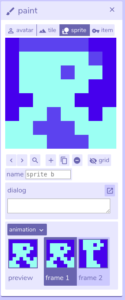
Bitsy art is 8×8 2-color pixel tiles with a 128×128 display. Any tile can optionally be animated with two 8×8 frames, be it the player avatar, sprites, or background tiles.
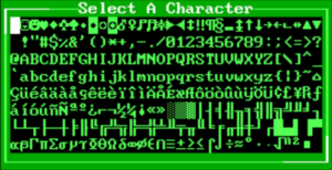
ZZT is limited to MS-DOS text mode, which is typically 640×350 resolution comprised of 80×25 character cells that are 8×14 in size. 256 non-editable character symbols are available.
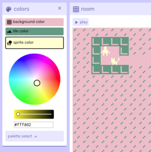
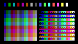
Bitsy supports just three on-screen colors by default: A color for the background, a color for terrain, and a color for the avatar and sprites. These colors can be anything that can be displayed in a web browser, and they can be adjusted on a per-room basis. ZZT is capable of fifteen simultaneous colors, plus black, not counting dithering. Most of those colors are highly saturated.
3rd Party MS-DOS utilities were available that could effect the following changes on a system running ZZT:
- Apply custom fonts
- Apply custom VGA colors
- Disable text blinking in favor of more color combinations in text backgrounds
These utilities were rarely used.
Sound
Bitsy has no built-in audio capability, though it is possible to add with mods or by embedding an audio source into a webpage that hosts the game. ZZT provides basic control of the PC Speaker / Beeper. When run through DOSBox, this is sent to your system audio as loud square waves that occasionally crack and wobble.
Engine Limits
Being an MS-DOS game, ZZT has hard limits on what can fit into a single World file, and in many cases, no warning is provided to a developer that those limits have been breached. ZZT doesn’t seem to do much in the way of checking data integrity. This is both a blessing in terms of what is possible, and a curse when it corrupts world files. Bitsy’s limits, sky high in comparison, are less likely to be breached during typical development.
Gameplay Behavior
With no moving objects, Bitsy has no action elements. Puzzles, if present, are typically based around making the right choices, taking the right routes, or having the right items. The only built-in interface element is the dialogue box.
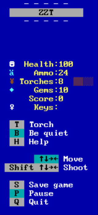
On the other hand, shooting and block puzzles are ZZT’s bread and butter. Although ZZT worlds certainly exist without those elements, there will always be ‘Health’, ‘Ammo’, ‘Keys’ and ‘Score’ indicators on the sidebar, along with instructions on how to shoot things.
Mapping 16×16 + 8×8 to 60×25 + 1×1
Bitsy rooms and ZZT boards are pretty different in terms of layout. What would be the best way to adapt one to the other? In hindsight, maybe this wasn’t a good project to convert.
Because of the tall dimensions of the text cells, a 16×16 map ends up being tall and distorted in ZZT. You could use multiple text cells to stand in for a given Bitsy tile (say, 2×1 ZZT cells for one 8×8 Bitsy tile), but even if you filled the entire 60×25 board with a good-looking recreation of the 16×16 original, ZZT player objects are always a single cell in size, and cannot be expanded to match the new scale.
Differences in Linking Areas Together
Travel to other areas is similar, but different enough to cause issues as well.
Let’s look at two kinds of linking: individual warp tiles that send the player to another area, and walking off the edge of the screen from one area to an adjacent location.
– Portals between areas
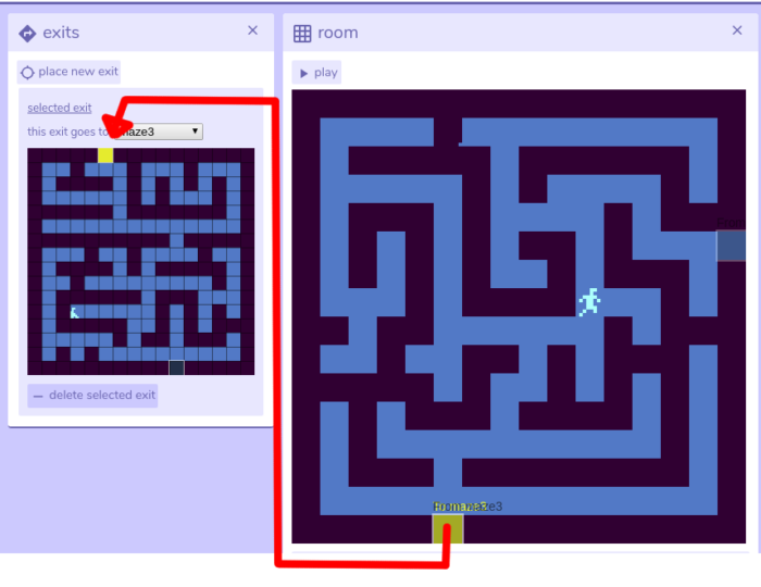
Bitsy allows the author to place single-tile exits that can transport the player to any room, at any possible coordinate. These exits cannot be modified during runtime, unless the game engine is modded.
ZZT has Passage cells that behave similarly to Bitsy exits. They can be destroyed, and tweaked ever-so-slightly during runtime, but placing new ones dynamically will only yield passages that point to the game’s title screen. (That’s right.) ZZT passages can be vulnerable to some esoteric problems, and they typically count towards a room’s limited tally of active objects.
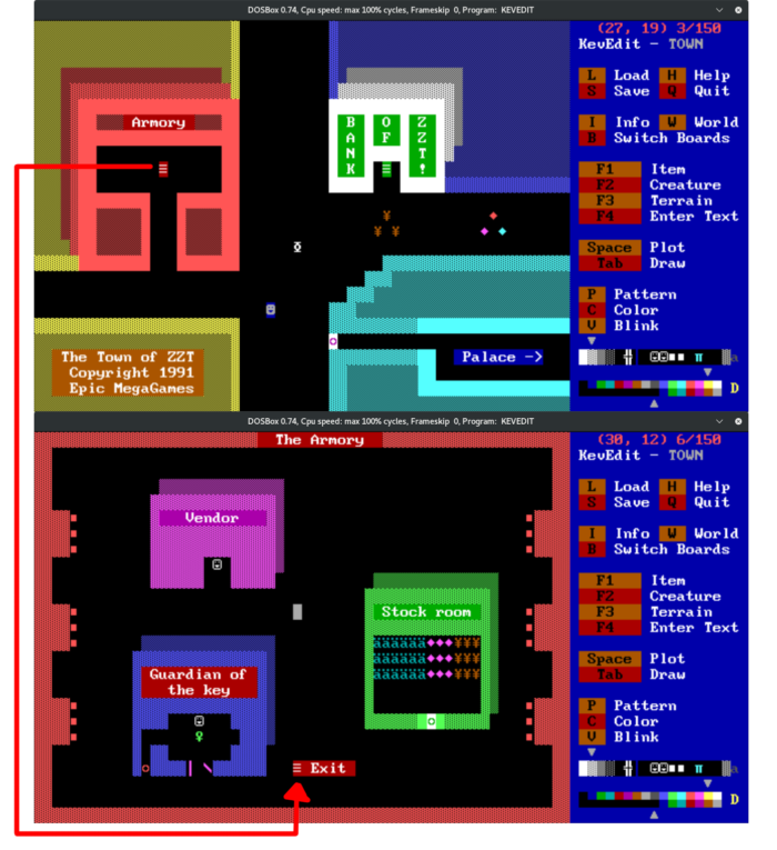
Mutually-linked Passages in the first couple of screens of Town of ZZT.
The subject of ‘esoteric problems’ in ZZT is just too large for a single blog post, but consider this example. In Bitsy, you can place exit A and exit B next to each other just fine. No issues. If you put ZZT Passage A and B next to each other, you risk the possibility that a Passage may be erased from the board if the player simply walks a single cell’s distance from A to B. Best case scenario: this is a minor visual problem, if A and B both point to the same destination board. Worst case: A and B pointed to different boards, and now your player loses access to an area and needs to either load from a save file or restart.
(This effect could be used intentionally, but I’m getting way off topic at this point, so onto the next item.)
– Linking areas by their edges
ZZT provides built-in support for linking the edges of one board to another. Let’s say you have two areas that are supposed to be adjacent to each other, and you want the player to be able to travel between them by walking to the bordering edges of those areas. In ZZT, you just define board edge exits: set Board A’s Eastern edge to point to Board B, and Board B’s Western edge to point to Board A. ZZT checks to ensure that the destination cell on the other board is not occupied, so the player can’t get trapped in a wall.
To do the same in Bitsy (as of 4.8), you would need to define an exit for every cell on the edge of both rooms — either that, or just place a single exit and indicate it as such by blocking other parts of the edge, or pointing it out to the user in some way. The former is prone to manual error. The latter is valid, but sometimes you just want to have a wide open area to travel across.
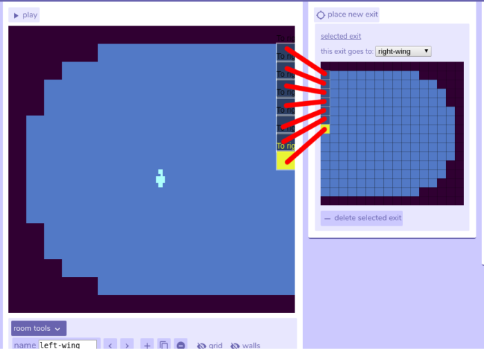
An array of room exits in Bitsy, half-finished.
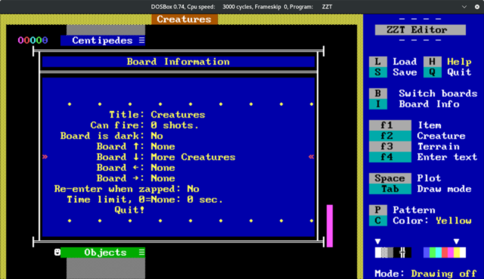
Board edge linking in ZZT’s Demonstration file.
In general, Bitsy exits are no-frills and instantanous — you can hide exits anywhere you want, and build up animations out of multiple rooms linked together. In contrast, ZZT board transitions are accompanied by a flashing purple screen transition.
Scripting
I have not gotten too deep into Bitsy scripting, so I can’t make a call on this one. I will say that both Bitsy and ZZT have, at minimum, basic support for setting flags that can be used to tailor how NPCs respond to the user. Bitsy sprites don’t budge an inch from their designated coordinates, while ZZT objects have a small set of flow control and movement statements that can be used, abused and layered in various ways.
Decisions
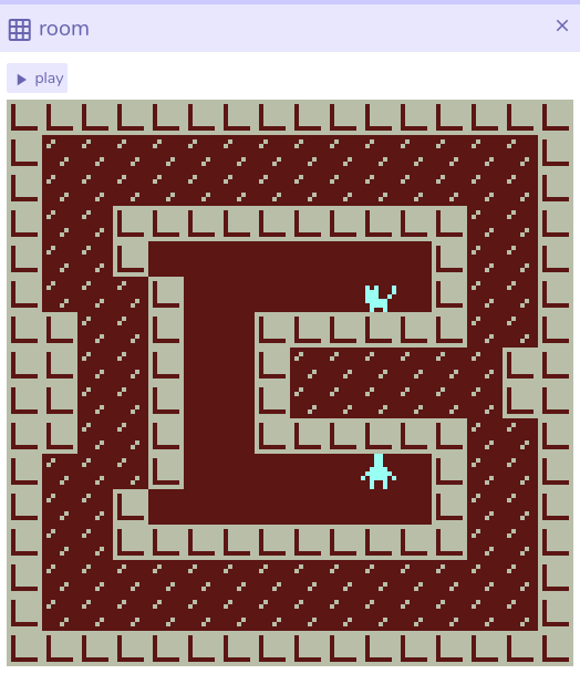
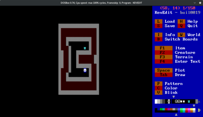
After trying a few ways of scaling up the Bitsy rooms to ZZT boards, I decided to just map one Bitsy tile to one ZZT text cell, and fill in the remaining board space with decorative wallpaper. This shortens the amount of time it takes to navigate through the maze, and prevents alignment issues when a sprite is supposed to block the player’s movement through a corridor.
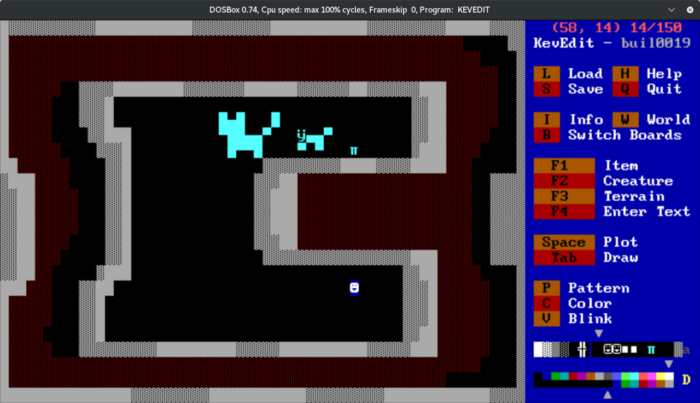
I initially tried making the rooms fill a larger percentage of board space, and making the characters multi-cell text mode doodles, but I couldn’t really fit it into the space properly. The player also looked tiny compared to the NPCs.
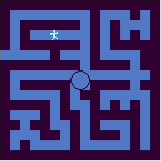
Bitsy room for reference.
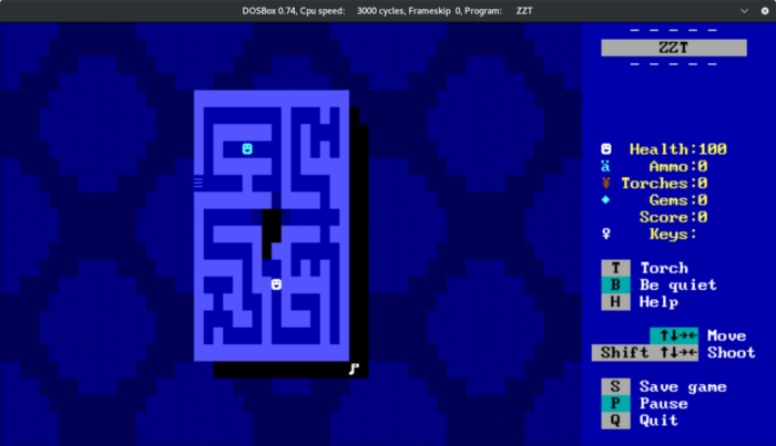
The room dimensions I ended up working with.
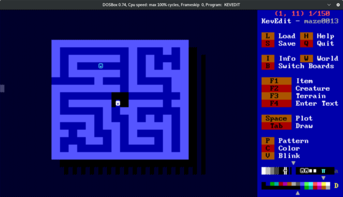
Using double-width blocks. It looks nicer, but takes longer to travel through, and introduces new issues wherever NPCs are supposed to block the player from the North or South.
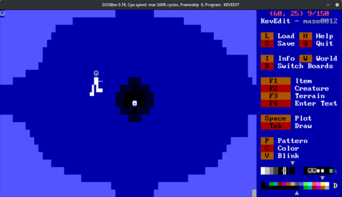
An unflattering test of expanding the intro room to the whole board.
I briefly tested displaying the NPC sprite art in the corner of the screen using an array of objects, but getting this to work would require either a significant amount of typing labour, or some kind of preprocessing scripting that I didn’t have the time to work out. Also, when a dialogue box is open, there is not enough space around the edges of the screen to display the sprite in its entirety, even if it was moved to all the way into the corner.
This array of objects would have consumed about 20% of each board’s object capacity, which could cause problems when trying to fix other issues, so it definitely didn’t seem worth the effort.
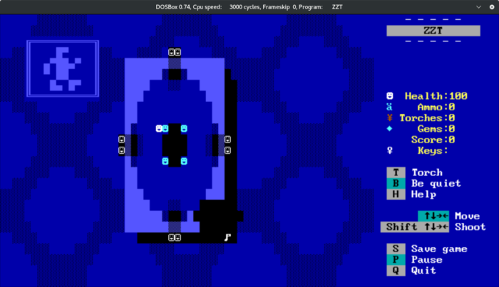
Testing having a ‘Monitor’ in the corner of the screen to represent the NPC you are in contact with.
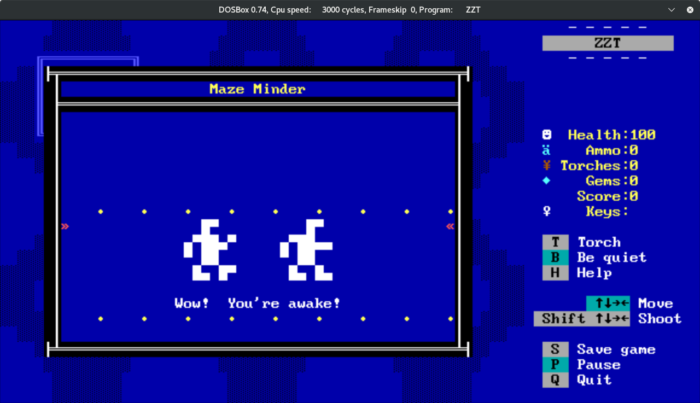
The monitor would not have been visible during dialogue scrolls, so I just embedded those graphics into the text scrolls themselves.
As mentioned earlier, DOS utilities can apply new fonts and colors at the BIOS level. Here is a quick mockup of what might be doable using additional DOS utilities:
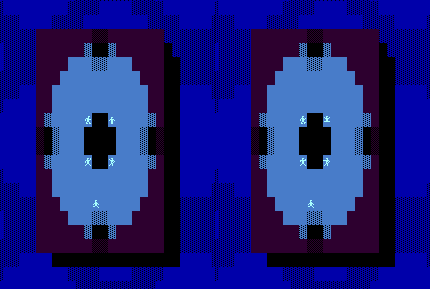
A quick count suggests that there would be enough room to hold all of the in-game sprite art within unused symbols on the code page. However, the characters are small and difficult to see, and all of their animation would have to be managed with ZZT scripting.
In any case, all NPCs in the final version are single #char 2 smileys. There is a visual indication when an NPC has nothing more to say — they will change over to a hollow #char 1 smiley.
![]()
Development Snippets
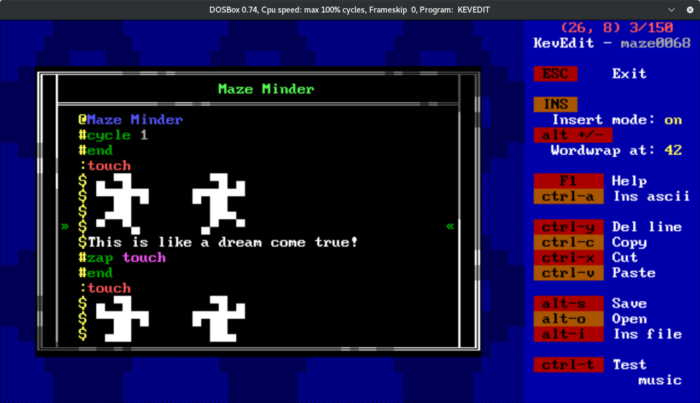
Converting dialogue.
@Maze Minder is the object’s name. This appears at the top of text boxes invoked by the object.
#cycle 1 makes the object process on every tick (about 10 frames per second).
#end halts program execution.
:touch is a built-in label. If the player walks into an object, the object will move execution to the topmost :touch label in its program, unless none exist.
#zap touch turns the topmost :touch label into a comment, so that you can talk to an object and get different behavior from them.
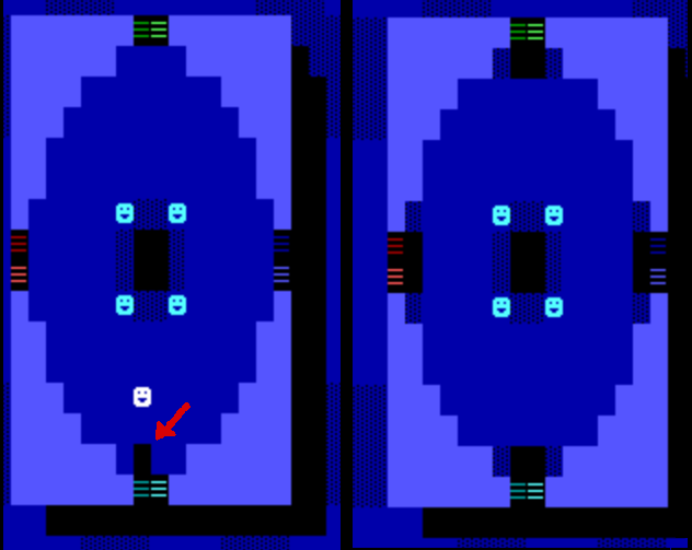
Left: Sometimes the ZZT player will damage floor graphics when exiting a passage.
Right: To make this less noticeable, you can place black empty cells around all passages on a given board, so that they at least look consistent.
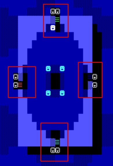
In the Bitsy version, this area is entered from one of the four sides, and can only be exited by jumping down the hole in the center. In ZZT, I placed hidden objects to destroy the passages that the player uses to enter this board. These objects use #put <dir> blue normal to replace the passages with blue dithered walls. I’m not sure why, but the commands didn’t seem to work fully, only destroying 50% of the passages. I had to repeat the command a couple of times in all of these objects to fully get rid of them. I’m sure there’s some explanation for it that’s slipping my mind.
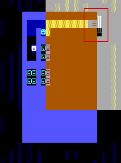
Using KevEdit’s selection highlight to show hidden terrain / objects necessary to prevent the player from wandering out into the background / wallpaper void area.
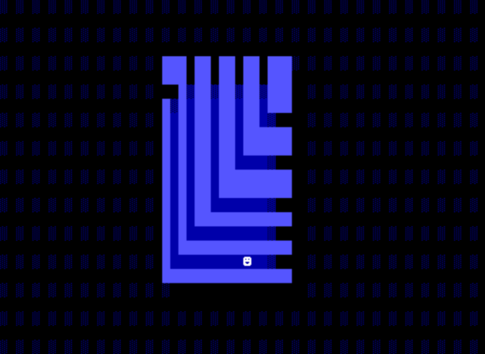
Here is the most complicated board in the ZZT version (though it’s really not too complicated by ZZT standards). The protagonist has been wandering the maze alone for a very long time, and seems to be going around in circles. In the Bitsy version, every rightmost walkable tile contains an exit that repositions the player on the next path along the top. This isn’t doable in ZZT with just passages, unless you make every path a separate identical-looking board2. However, a bug known as player cloning can be used to accomplish this kind of warping.
2 (A passage can send the player to a different part of the same board, but it only works when traveling from upper-left to lower-right, to a passage with a matching set of colors. This board needs to move the player in the other direction.)
Cloning is possible simply because ZZT includes “player” as one of the entity types that can be invoked through scripting, along with various items and monsters, even though it’s buggy and plainly unintentional.
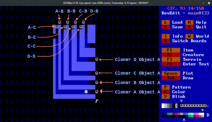
Four sets of clone-generating objects are used, one for each teleport point. In each case, Object A waits for the player to come in contact with it. When this happens, it sends a message to Object B, which places an empty space to the South of itself, then a clone of the player to the South. After doing this, it sends a message to Object C, which prompts that object to wait for one tick, shoot a bullet to the East, and then place a blue solid cell to the East as well.
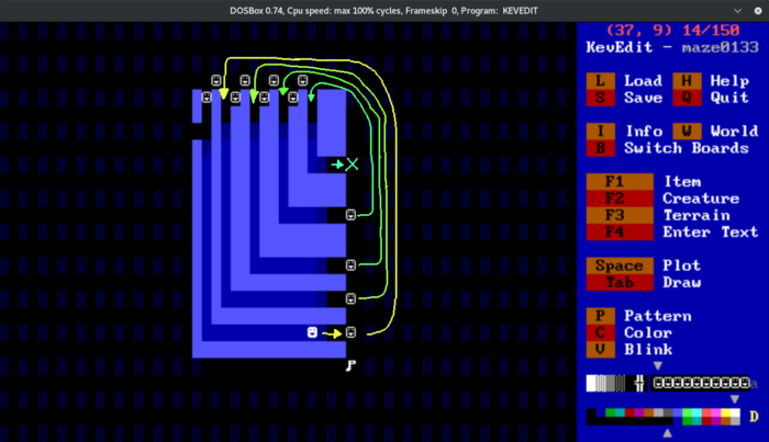
Because of how ZZT behaves internally, this causes the Player to teleport to the East of the newly-minted clone at the top of the area. After one tick has passed, Object C shoots the clone, destroying it, the original player left unscathed.
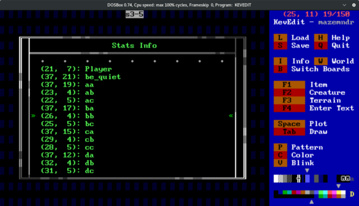
To make this as seamless as possible (and it’s not really: you can see the cloned player for a fraction of a second before it is destroyed), each set of objects needs to be placed in the correct order, or else the commands will require additional ticks to process. If everything is in order, then each successive object can begin processing its script as soon as the engine will allow.
It’s very interesting that this bug functions as a consistent (though convoluted and potentially fragile) way of moving the player around. This article on Museum of ZZT contains more information if you’re interested in reading about player clone behavior.
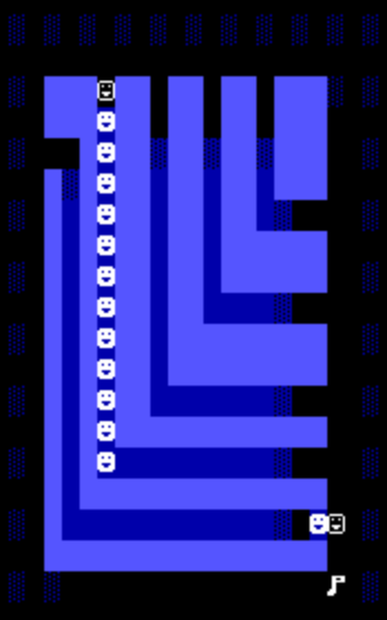
Whoops.
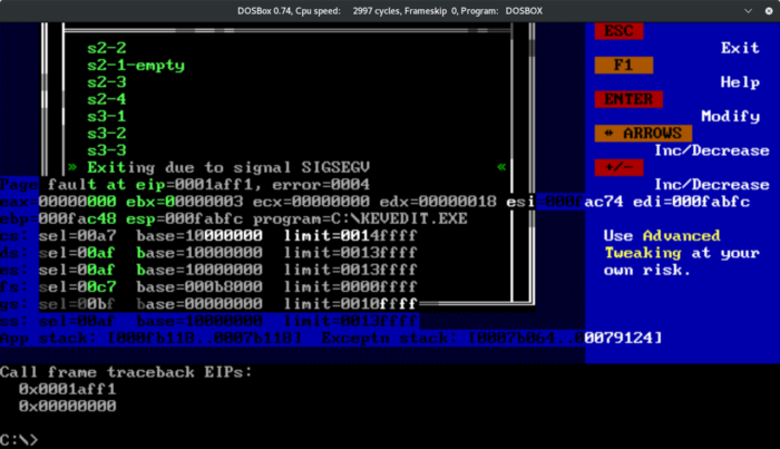
KevEdit is a wonderful tool, but do take precautions in case it crashes.
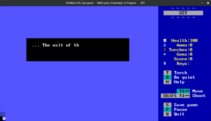
The ending board mimics a Bitsy ending text box with objects. On every ZZT board except for the title screen, the player has to be present on-screen, somewhere. I ended up sticking the player in the lower-left, hoping it would be minimally intrusive if I included some objects around it to prevent movement.
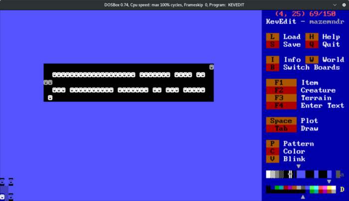
An object to the North of the player always places a blue fake wall to the South, pushing the player downwards.
An object to the East is supposed to place blue fakes to the West, but I forgot that because of a programming error in ZZT, this never works when the destination coordinate is on the last row of the board. The player is free to wiggle around in the corner while the ending text rattles off.
Oh well.
The final conversion can be found on itch.io.
(Edit 18/Mar/2020: Added note about ZZT’s reverse engineering in 2020.)