Regrettably, I don’t have much to show for this month. The overall look of ProdUI has improved, though it currently still falls short of being usable for a real GUI application.

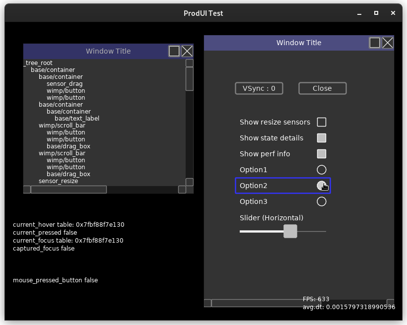
ProdUI as it currently stands. The left window has a list of all widgets in the UI context.
(I’ve gone so long without a video that I’ll just stop mentioning when I don’t have one for the month.)
Summary
- Worked on prodUI skinning system, and a simple built-in skin (Vacuum)
- Converted slider bars to a simpler, more modern style. Planning to convert scroll bars to this style as well
- Various fixes to the context + callback structure for ProdUI (generally, sacrificing flexibility for more predictable behavior)
Vacuum
In August, I had been experimenting with two skins: one drawn with love.graphics.* primitives and text, and the other relying more on 9-slice textures. I’ve set the latter aside because scaling textured skin elements is tricky and I’d rather focus on just one skin module for now.
The skin system more or less works as described in August. It seems good so far. I’ve merged normal buttons, check boxes and radio buttons into the same widget definition with different sub-skin IDs. I’ve found myself preferring slightly more complex “flat” widgets to ones which spawn child widgets for every little aspect, like text labels or single graphical ornaments.
Less straightforward are things with moving components, like slider bars. The thumb size and trough length are context-dependent, and you might want the text label to be in any number of locations. So, it’s probably best for the widget to store that information, and just have the skin renderer paint to its specifications.
Thimble
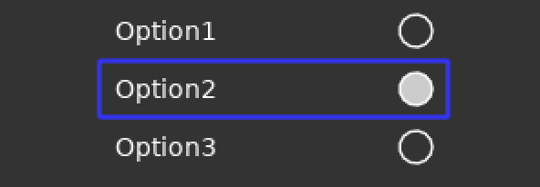
I have to write this so that the next part makes sense. This blue thing, I am calling the thimble:

It’s a cursor, but I don’t want to get it confused with the mouse cursor or the text cursor (caret). If a widget has (holds, takes, etc.) the thimble, it means that it has an outline like this, and pressing enter should activate in a way similar to clicking on it with the mouse. The number of thimbles that the UI context can have at any given time is 0 or 1.
I was calling it the focus, but that can be confused with which window is currently on top. (A window can be topmost without hosting the thimble in its widget tree.) Alright, moving on.
Simplifying Sliders and Scroll Bars
I went through some trouble to make scroll bars behave like they did in early Windows, where explicit up/down buttons are placed on the edge of the bar, and clicking the trough sort of behaves like the PageUp and PageDown keys. Internally, the trough was the parent widget, and the thumb and the two buttons were additional child widgets. I used similar code to implement slider bars.
It felt nostalgic, but in the case of the sliders, it led to a problem where the thimble would be given to the thumb, not the parent trough. That shouldn’t have been a big deal, and yet it caused a lot of issues with managing the thimble when clicking between multiple windows. I believe I fixed those problems, but it really turned me off from embedding child widgets within things that should be “leaf node” controls (or at least, giving those child widgets the ability to hold the thimble).
I had to admit that this kind of slider handling wasn’t actually very good from a UX standpoint. It feels better to just click anywhere within the trough rectangle, and have the thumb teleport to the mouse (or as close as possible to it). If extreme changes were a concern, the thumb could be programmed to slide towards the mouse at a slower speed. Anyways, with that behavior, a child widget isn’t required to implement the thumb at all.
The slider widget code was an awful mess, and converting it to the new style was so much trouble that it might have been easier to start over from scratch. Scroll bars will have to get the same treatment soon.
Closing
Yeah, that’s really all I have. I’m going to make some personal adjustments and try and have a better offering for October. I’ll update again on the 31st or so.